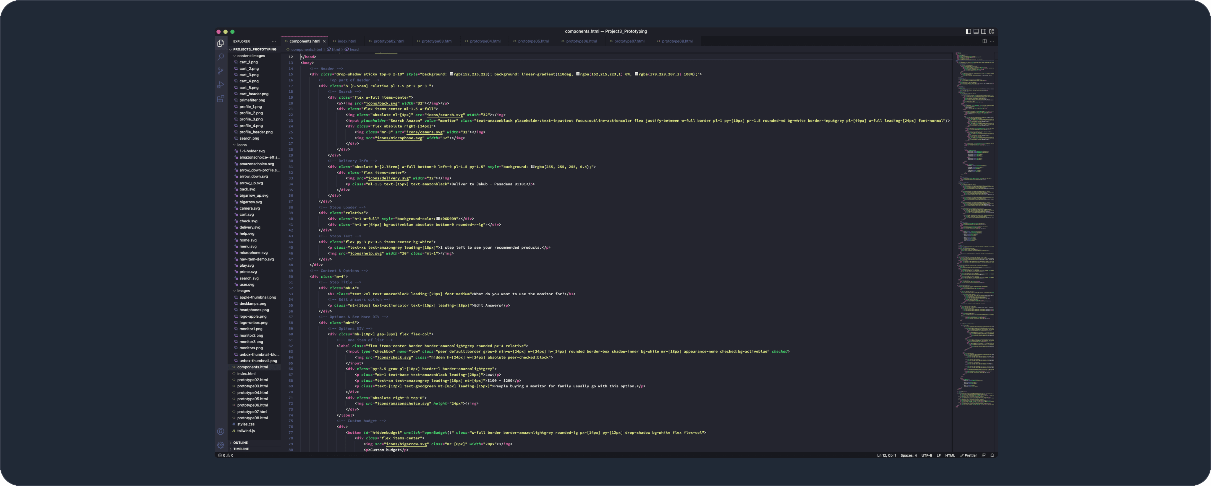
Video recording of a prototype made using HTML, CSS/Tailwind and JavaScript. Prototype showcases native mobile app version but is running in a browser.
Project Process
I made archetypes showcasing needs, goals and user stories of different groups of people.
Tech Savy
— Wants to filter based on deep technical specifications
— Is overloaded by the amount of possible options
— Wants to see options even out of filter scope
— Wants to get recommendation on different aspects
— Wants to watch videos and read professional reviews
Busy Family Guy
— Wants to see different price ranges
— Doesn’t have time to do research
— Wants to filter based on features
— Wants to see different price range options
— Wants to be able to see alternatives of recommended options
Retired Person
— Wants to filter based on job a product does for them
— Doesn’t know much about features
— Wants to explore different functionality
— Wants to get more info about specific steps in the flow when getting lost
— Wants to get one recommended option
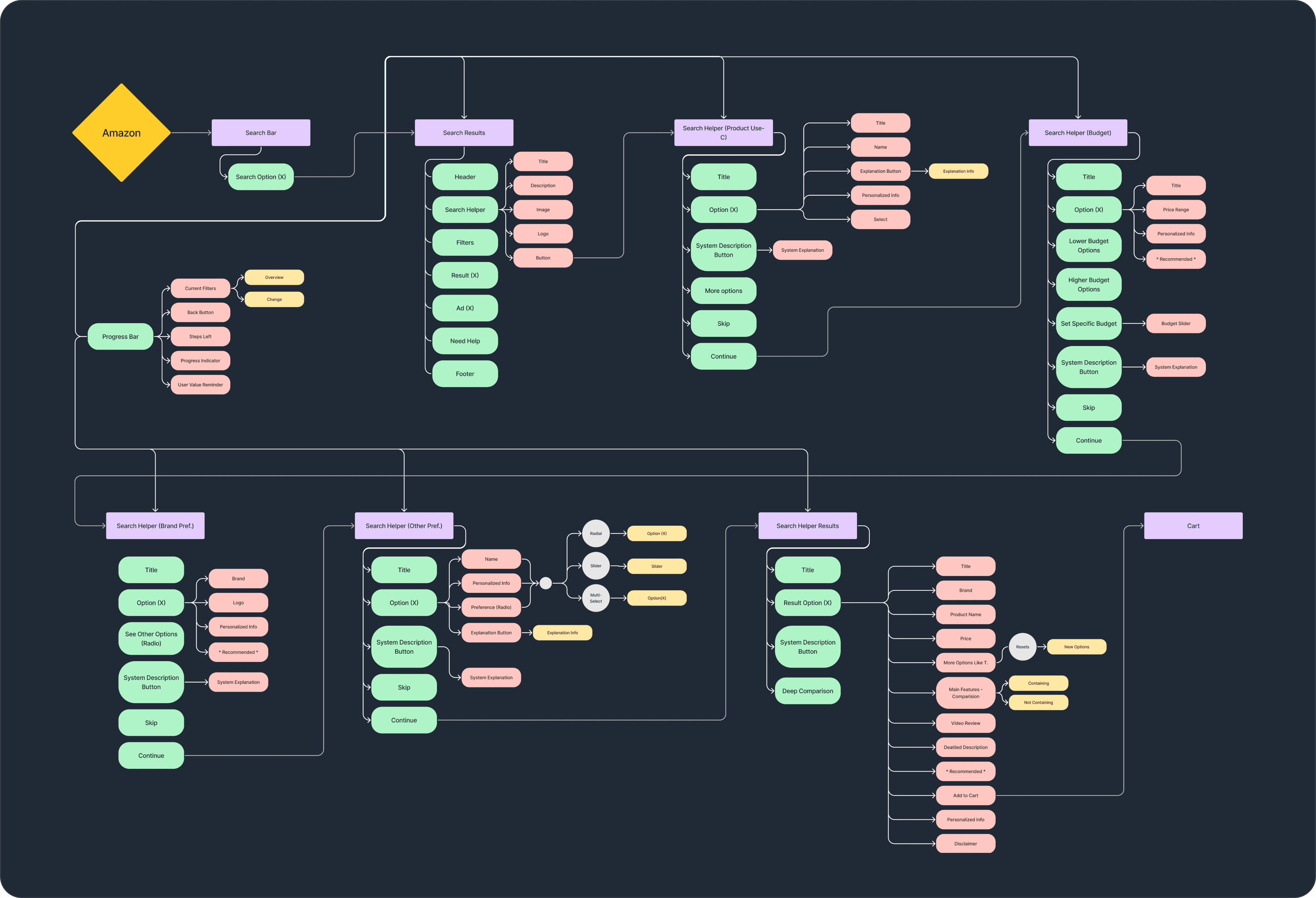
To define the features and understand the flow, and all the specific components I need I’ve created a sitemap.
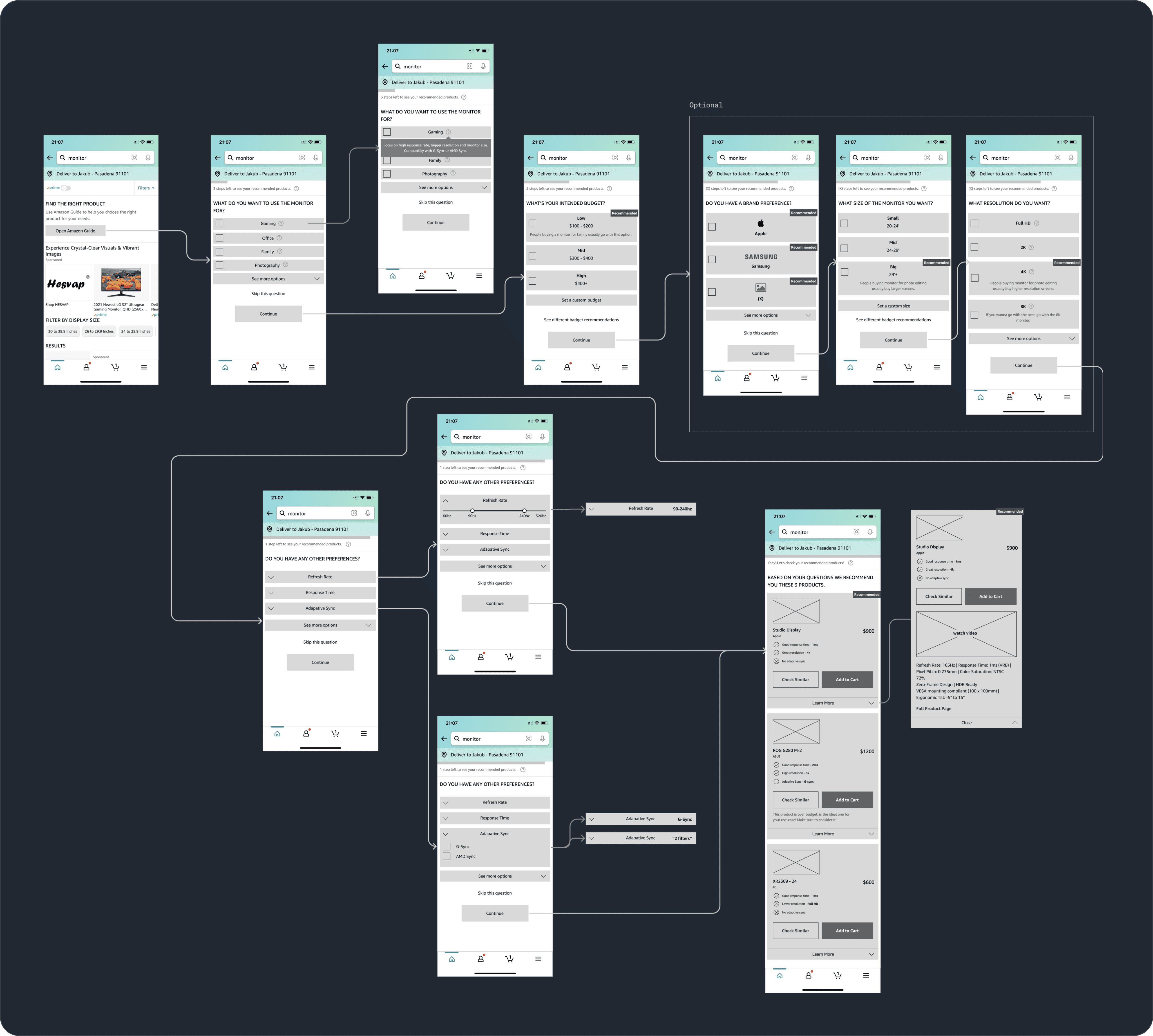
Afterwards, I’ve created wireframes to define specific pages and be alligned on the content.
Based on wireframes, I started ideating on the layouts, visual hierarchy and the way I communicate different information. The focus was to strictly follow all the guidelines of Amazon in terms of margins, components use, colours, etc.
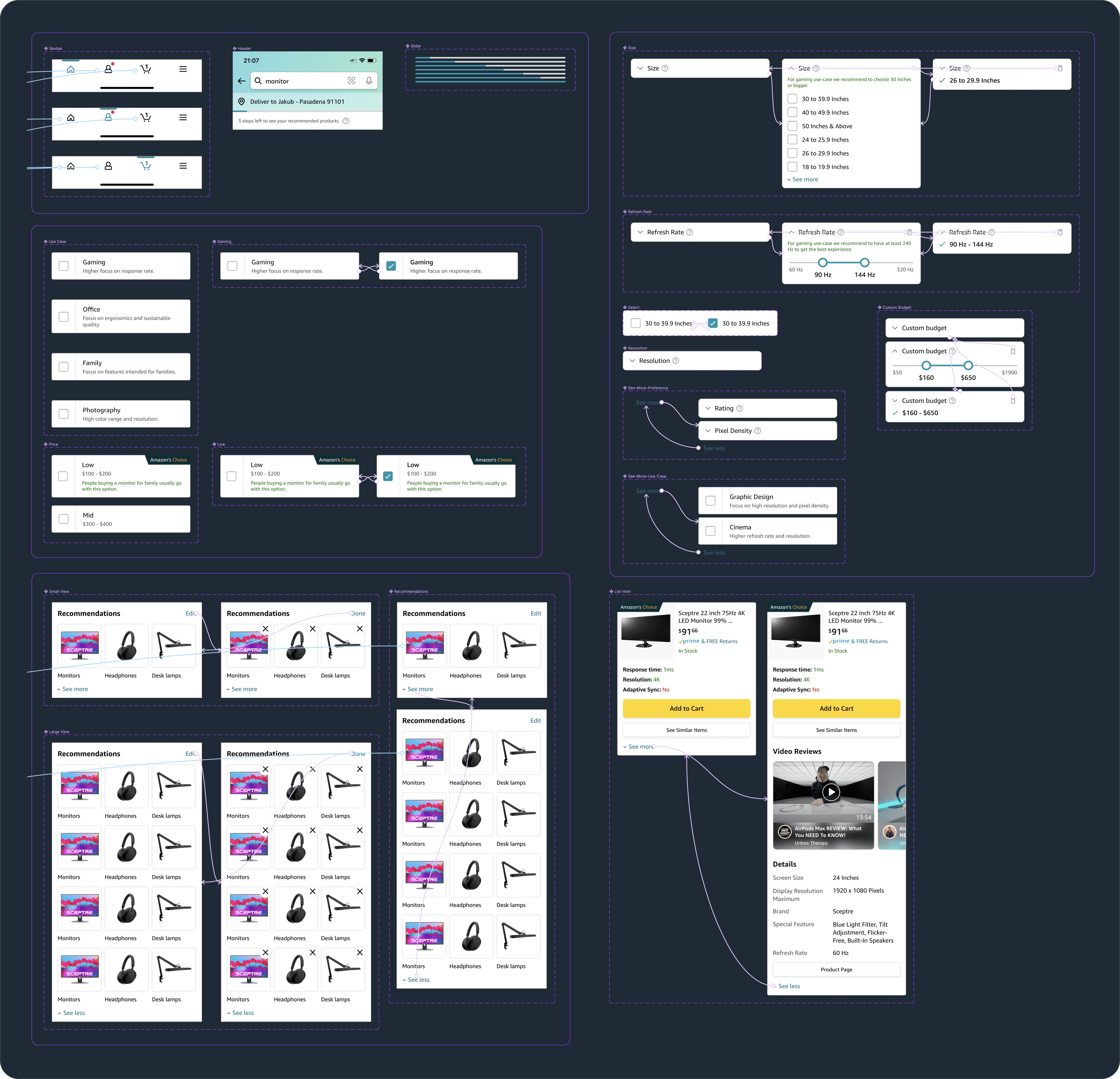
To test those ideas I’ve created interactive prototype in Figma using variants, properties, nested instances and booleans.
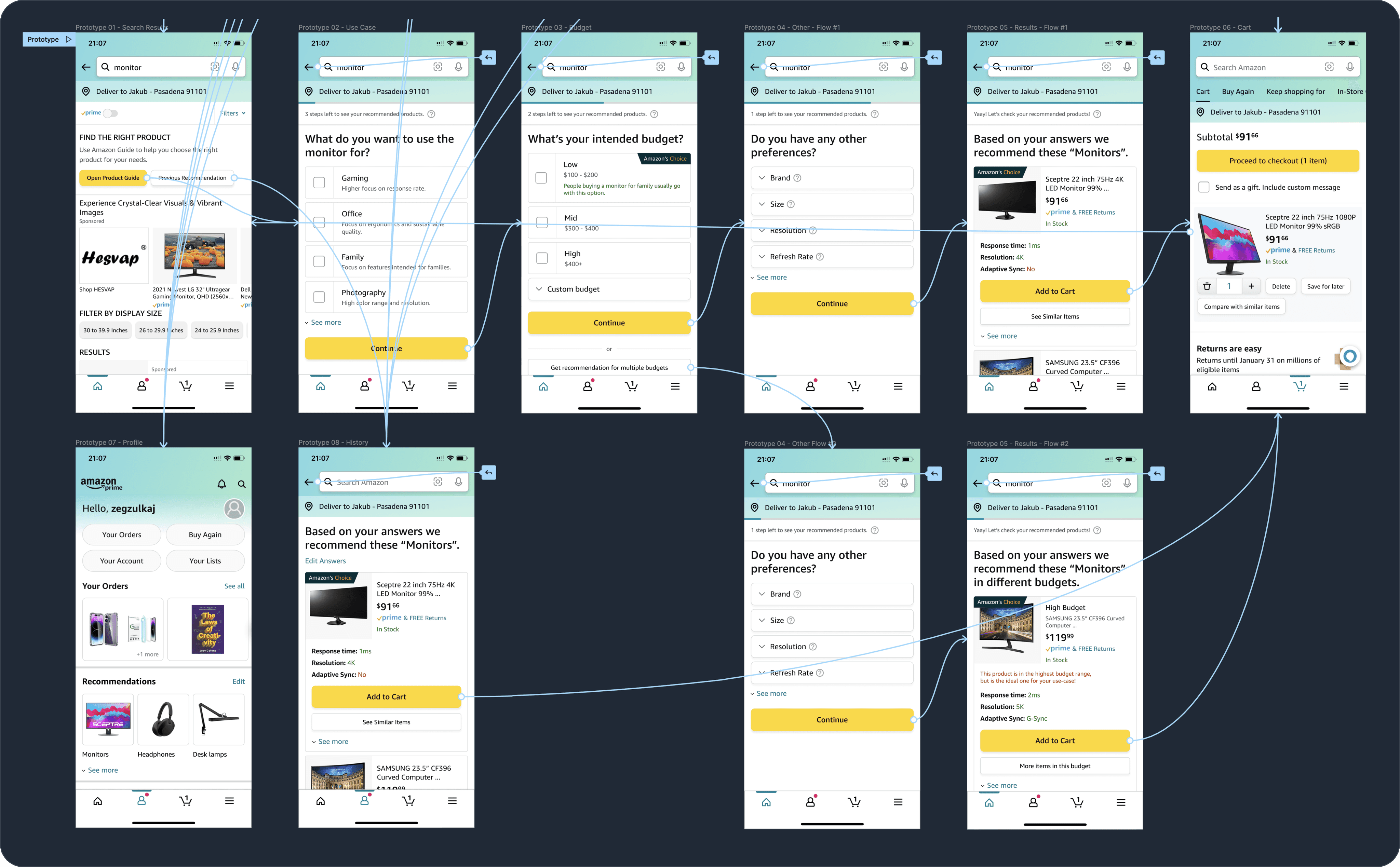
Lastly, I spent time recreating the prototype into a browser using HTML, CSS/Tailwind, and a bit of JavaScript.
